Task: Logo design for Meats 365,
an online meat ordering company that aims to provide service, year-round ( i.e. 365 days)
Client loved a starting point (insignia and colors) so that was the fixed part. Our task was to extend and add name.
This is a starting point let’s see where you go with this
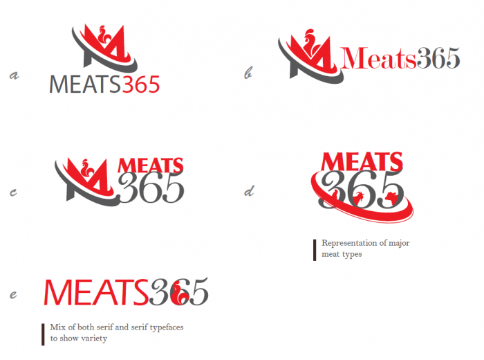
After studying the starting point, some logo design proposals were provided to the client. The color was to be in red tones, to match the meat persona. Red is not only a vibrant color, but it also tends to increase appetite.
Since this business was not limited to one kind of meat. We decided to show variety with iconic representation in option d, as well as make the logo look like a single design element. Some logo designs were top-bottom to be more in a square shape, while others were side by side.
Below was a wild idea, showing the cut out meat like a calendar, to show the year around availability in visual form. The bright red in center was balanced by the darker red on both side.

After initial proposals, one design was further developed refined and finalized. The final color was a bit on the darker side, but the overall tone was matching the secondary grey color. This makes it easy to print and display on web i.e. more contrast = more prominent.
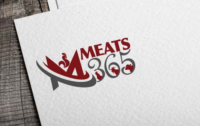
and now we have another happy client :), Enjoying this? View more
or you can hire Arif S. (16 years veteran designer) for a custom logo design for your business.


